Exploring the Numer.ai dataset
8th July, 2018
15 min read
Exploring the Numer.ai dataset
I'll assume you have already created a Numerai account and have downloaded and unzipped the data you'll need from the 'rounds' page.
You'll get a bunch of files, but for the moment we are only interested in the training and tournament data files.
I'll also assume you have a working Python environment that is ready for data-science adventures.
numerai_tournament_data.csv
numerai_training_data.csv
The goal of this post, and follow-up posts, is to highlight some approaches to exploring a dataset. In this particular case, the numerai dataset is both challenging and somewhat unrewarding as the data has been anonymised, normalised and contains very little differentiation between features. Additionally, there are 50 features, 6 targets classes and the data is grouped into non-sequential, indeterminate time periods called era. All of this makes it difficult to choose one feature over another, engineer new features or in the end gain any competitive advantage - Numer.ai is a competition after all.
Code
Clone my numeraiexplore repo which complements this post.
Training data columns
The first column in the training data is an id which is used as a key for your predictions.
The second column era as Numer.ai says 'specifies some period of time'. It is tempting to think that sequence based predictions could be used between eras, but the duration of each era within a round, and between rounds is unknown and may not even be sequential between adjacent eras. One criteria to score the predictions is to be consistent across the majority of eras. Numer.ai provides hints and they emphasise consistency with the following advice
Having trouble with consistency?
Try adding the objective of doing consistently well across all eras directly into the objective function of your model.
The data_type in the training data file is of course 'train' for all the examples.
Then we have fifty features from feature1 to feature50. Numer.ai cleans and regularises the data in addition to obfuscating it. This serves two purposes for Numer.ai - it provides a consistent cleaning and regularising approach for the data, removing inconsistencies between data scientists that could effect the final result, and also allows Numer.ai to obfuscate the data.
Finally, there are a number of targets, conveniently labelled with names - Bernie, Charles, Elizabeth, Jordan and Ken - so target_bernie etc.
Load it up!
Let's load the data
import pandas as pd

training_data = pd.read_csv('./numerai_training_data.csv', header=0)
Stats!
Now we can have a quick look at the stats of each column over the whole dataset using pandas DataFrame.describe() - the data is already of type DataFrame as we loaded it with pandas.
print(training_data.describe())This will automatically exclude non-numeric columns. A typical feature column will look like this
            feature1
count  393613.000000
mean        0.467463
std         0.132239
min         0.000000
25%         0.374720
50%         0.466740
75%         0.558860
max         1.000000
These should be familiar - you get the mean, standard deviation, min and max values and also the quartiles - which can help to highlight skewed data and suggest approaches, even at this early stage.
Since we just used the whole dataset with all the columns the targets are also included, and these are not useful, we'll exclude them.
        target_ken
count   393613.0000
mean         0.4996
std          0.5000
min          0.0000
25%          0.0000
50%          0.0000
75%          1.0000
max          1.0000
We can produce a list of the feature column names and use that to select just the feature columns into a new DataFrame
features = [feature for feature in list(training_data) if "feature" in feature]
X = training_data[features]
What do the stats tell us?
They are a very handy tool for giving an overview, but in terms of highlighting patterns in the data, there is not much to see. The max and min are all between 0 and 1 as we would expect from regularised data. The mean doesn't change too much from 0.5 and the standard deviation wavers around 0.1. Even the quartiles are fairly regular from feature to feature.
Histograms
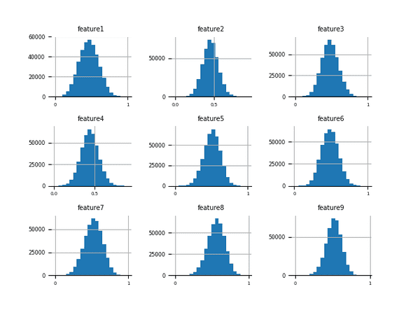
Histograms split an axis into a number of divisions, called bins. The bars in the histogram represent the count of values that fall in the range of values represented by each bin. The shape of the histogram gives a very quick visual check of the distribution of a particular feature. In the case of the numerai data the distributions are all gaussian, so-called normal, distribution.
You can generate the image below by running the histograms.py script in the numeraiexplore repo.
You can see there is a little variation of the mean and some slight skew of the distribution from feature to feature.
Density plots
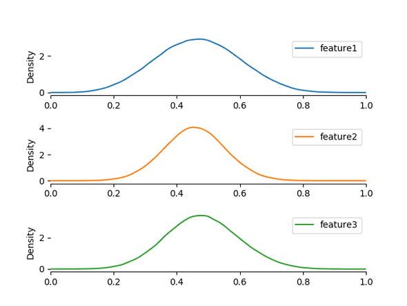
Density plots are very similar to box plots as they measure the density of values of a feature, but represent the density in a continuous curve. The plots don't show much detail of interest, just the same expected Gaussian distribution with some variation for each feature.
You can generate the image below by running the density.py script in the numeraiexplore repo.
Box plots
Up until now we have been looking at univariate analysis. It is useful to see not only how the distribution of the data changes from feature to feature, but also how it changes for a given class on feature.
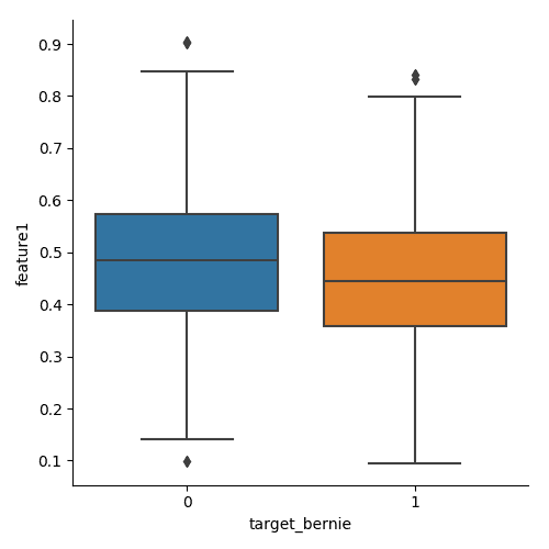
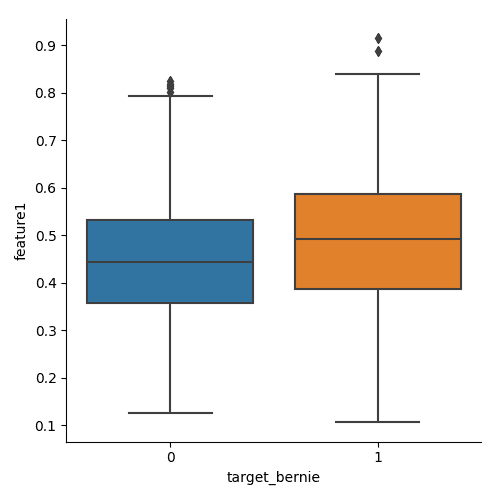
Box-plots show a lot of information. The box bottom and top indicate the 25% and 75% quartile respectively, while the line marked inside the box is the 50% quartile. The so-called whiskers that extend from the box are 1.5 times the distance from the 50% quartile to the end of the box from which the whisker extends. As the data is regular, there are only small variations in the length of the whiskers.
The points that lie outside the range of the whiskers are known as outliers. The points within the whiskers are not shown directly, but are indirectly represented as they contribute to the calculation of the quartiles.
Another variation determines the whisker lengths by the minimum and maximum observed values rather than a set ratio based on quartiles.
In the case of the Numer.ai data our classes are binary target_bernie, target_ken etc. They indicate whether the feature values in a row will predict a particular target. Boxplots are often rendered side-by-side for a single feature faceted by a class - we can use the target feature values as a class. Below you can see the box plot for feature1, classed against target_bernie for era1.
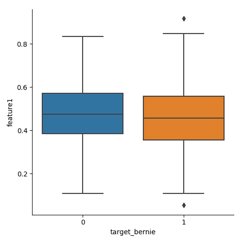
The figures below plot the same data but for era2 and era3
Obviously there is some variation between era, but we have no idea what the era represent beyond 'a period of time'.
You can generate the images above by running the boxplot.py script in the numeraiexplore repo.
Violin plots
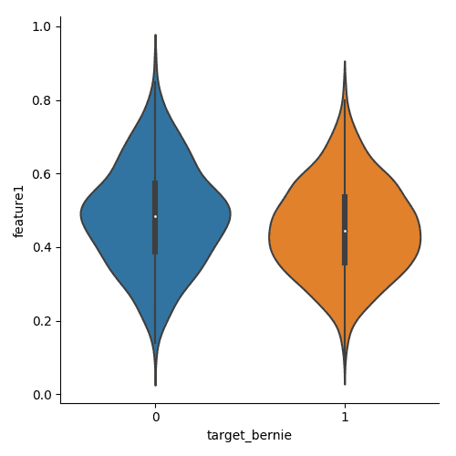
As mentioned above, the box plots do not show a representation of the individual points used to calculate the statistical values. Violin plots replace the box with a density plot, usually vertically mirrored. You can see the violin plot for feature1, classed against target_bernie for era1.
You can generate the images above by running the violin.py script in the numeraiexplore repo.
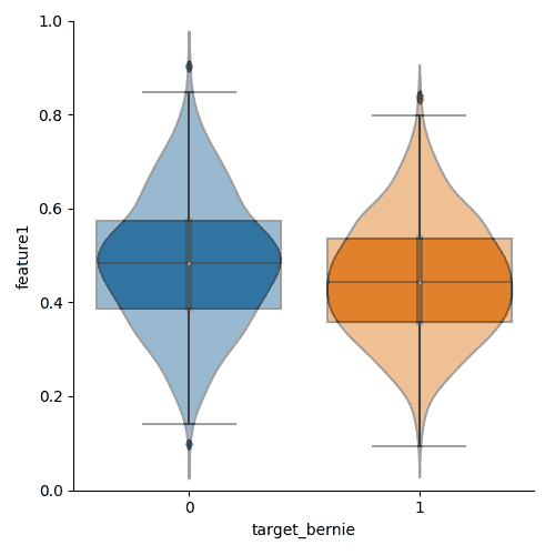
I've overlaid the box and violin plots - using a graphics program; no script for this yet - in one image so you can see more clearly the different aspects of the data they highlight.
What is hidden
Ultimately, we want to know if our data is suitable for training a model to make predictions. We want to be sure the features are not highly correlated to each other as correlated features usually represent the same information and reduce the number of features available to our model during training.
We want to know if there are patterns in the data - can we group features to create more features we can provide to the model? Are the values regular and normalised? In the case of Numer.ai data we know the latter is true.
Correlation matrix
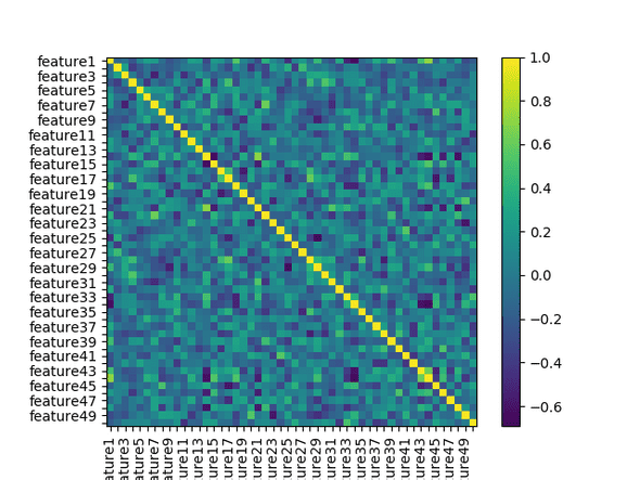
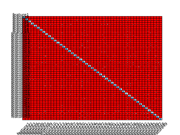
We can calculate how much each feature is correlated with others in the feature dataset by using the DataFrame.corr() method provided by pandas - our dataset is already loaded into a DataFrame. This will measure the correlation between each feature in the dataset and add that measure to a new dataset. We can then plot that data to see what patterns emerge.
A longhand snippet is shown below, but you can run the script correlation_matrix.py from the numeraiexplore repo
import pandas as pd
import matplotlib.pyplot as plt

training_data = pd.read_csv(
    '../numerai_datasets/numerai_training_data.csv', header=0)

# pull out the feature column names
features = [feature for feature in list(training_data) if "feature" in feature]
# select only the feature columns
X = training_data[features]

# calculate the correlation
correlation = X.corr()

# show it!
plt.imshow(correlation, cmap=plt.cm.PuOr, interpolation='nearest')
plt.colorbar()
tick_marks = [i for i in range(len(X.columns))]
plt.xticks(tick_marks, X.columns, rotation='vertical')
plt.yticks(tick_marks, X.columns)
plt.show()
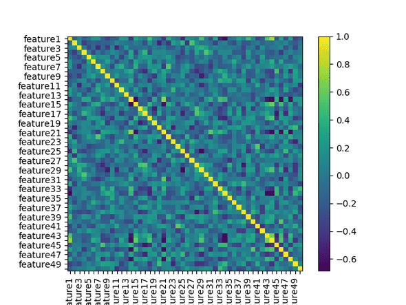
The plot shows how much correlation there is between features - in this case, yellow shows high positive correlation - when one feature changes, the other tends to change in the same direction - and purple shows strong negative correlation. The features are plotted along the x and y axis which is why you see a yellow diagonal line here - we expect to see each feature very highly positively correlated with itself.
We can see that the dataset is not swamped with very strong correlations one way or the other - most of the figure shows no more than mild correlation. However, there are a number of both positive and negative correlations - it would be better to eliminate these through feature engineering, feature selection or complexity reduction.
Targetted data
One thing we can also do is look at how the correlation changes between features for different targets. If we group an era's features by target_bernie and plot correlation matrices for each we get the matrices below. We can generate the images below by running the python script correlationmatrixtarget.py from the numeraiexplore repo
The first shows the correlation for era1 features associated with 0 in the target_bernie column.
This matrix shows the correlation for era1 features associated with 1 in the target_bernie column.
Visual inspection doesn't reveal a whole lot, although it is clear there are some differences, so lets see the difference between the correlations by diffing the images.
Note: interestingly, if you plot the targeted correlations using data from all eras then there is no difference in the correlations - you do still see a small shift in the strength of the negative correlations.
What I take from this is that a model trained to work with an individual era's feature values rather than all the eras is likely to perform better - which was already indicated to us by numer.ai.
Caveat - Anscombe's Quartet
Relying only on statistical analysis and correlations to determine what features are important can be problematic. Francis Anscombe created four small datasets that shared the same statistical mean, correlation and linear regression. However, plotting the sets revealed very different charts and highlighted the effect of outliers and grouping on statistical properties
![By Anscombe.svg: Schutz
Derivative works of this file:(label using subscripts): Avenue (Anscombe.svg) [GPL (http://www.gnu.org/licenses/gpl.html), CC BY-SA 3.0
(https://creativecommons.org/licenses/by-sa/3.0
) or GFDL (http://www.gnu.org/copyleft/fdl.html)], via Wikimedia Commons](https://upload.wikimedia.org/wikipedia/commons/thumb/e/ec/Anscombe%27s_quartet_3.svg/512px-Anscombe%27s_quartet_3.svg.png)
In short, the statistics may say the features are the same or are correlated strongly, but plotting the data may show a very different relationship.
Scatter plot
With that in mind we will look at plotting the relationships between individual features. The script scatter_plot.py from the numeraiexplore repo will generate the images shown below. Most of the previous plots and analysis were univariate - i.e. a single variable - scatter plots are pair-wise analysis.
Examining the correlation matrix above we can choose a pair of correlated features and a pair of uncorrelated features and plot the pairs one on each axis of a chart, to generate what is known as a scatter plot. This can highlight any interesting patterns between two features.
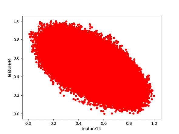
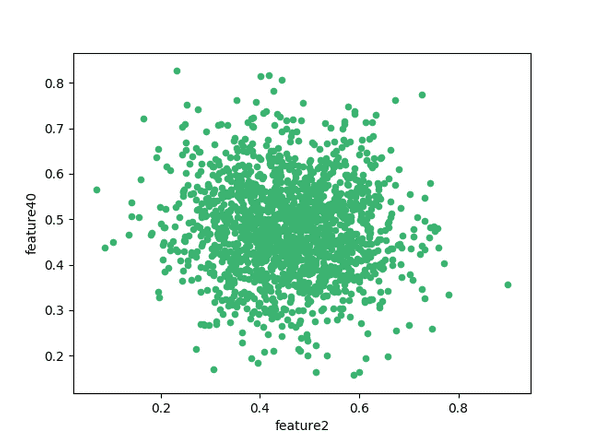
We will choose feature14 and feature44 as the correlated pair, and feature2 and feature40 as the uncorrelated pair. Plotting the correlated pair over all eras results in
You can see that the general trend is an oval whose centre-line runs diagonally from high to low in relation to the x-axis. The position on the correlation matrix for these two features was purple, which indicates a negative correlation, and the scatter plot bears this out - this is the typical shape of a scatter plot of negatively correlated features; the stronger the correlation, the narrower the oval, eventually approaching a straight line for the strongest correlations.
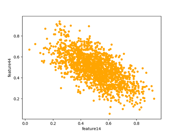
The scatter plot above is generated using all the data across all eras. We don't expect the relationship between the features to change between eras; let's see if that is true.
They definitely have the same general shape, no surprises there.
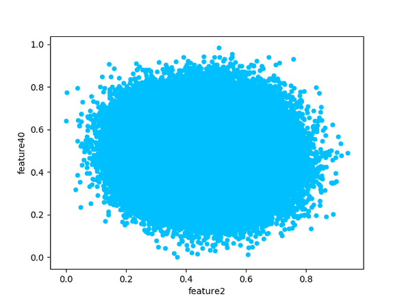
Now we plot the features that are independent and should show no correlation.
You can see the shape is very different, showing a uniform gaussian distribution around the centre of the chart.
These plots are interesting, but don't add much value beyond what we knew after creating the correlation matrix. Also, we really want to see the scatter plots for ALL the features in a matrix to see if any have unusual grouping or structure, doing that manually would be impractical.
Scatter Matrix - correlogram
Instead of plotting a scatter plot for each pair of features we can use pandas DataFrame.scatter_matrix() function to automatically create a scatter plot for each set of features, and then arrange the plots on a matrix much like the correlation matrix. If there are any patterns between features - correlated or not - this should help to expose them.
You can generate the images below by running the scatter_matrix.py script in the numeraiexplore repo
One caveat here is that we are dealing with a reasonable amount of data - 50 features in a matrix and hundreds of thousands of data points, each plotted individually - this could take a long time. For the first pass, where we want to get an overview of the shape of the data we should perhaps focus on one era only and if necessary only take a random sample of 10% of the data.
Hmm. Not much to learn from that! Although, one feature you should be aware of is the histogram along the diagonal - this is more useful than showing a straight line representing the correlation of the feature with itself.
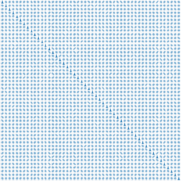
Using the plotting library seaborn we can actually see all the data properly, although the image is very large - you can generate both images below from scattermatrixseaborn.py in the numeraiexplore repo. A reduced size image is shown below, and you can download a larger - but still smaller than original - image here if you wish to look at the details closely
You can see there the data is, as we already knew, quite regular with not much irregularity. What would be most useful is if there were patterns, skew or groupings, within each plot rather than correlations between features. In general you want to use independent variables as correlations, whether positive or negative, reduce the effective number of features we can work with. In later posts we will examine ways to
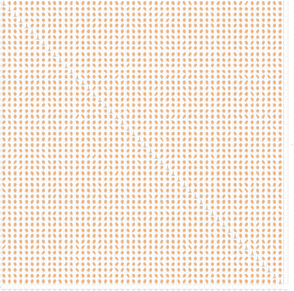
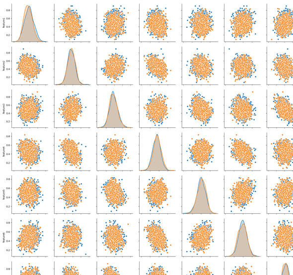
Seaborn also allows us to group and colour each plot by one of the features. In this case we want to see if there is a difference between features associated with the different values of feature_bernie. You can see the yellow scatter plots are fringed with some blue - the yellow represents feature values that are associated with target_bernie value of 1 (i.e. a positive prediction is expected).
You can download a larger version of this image here.
This nicely highlights that there are differences between the features that should lead to a positive prediction of target_bernie (whatever that might be in reality...) and those that will not make such a prediction. In the image below, the blue plots represent features associated with negative predictions - literally, the column feature_bernie is zero on the row - and the orange are positive. The plots of the features with themselves show a distribution graph by default - you can clearly see the varying distribution.
Summing up
Individual eras are important, but because we don't know the size of an era, or how it relates to other eras the training should include focussing on individual eras rather than only lumping all the data from all eras into one.
If we knew what each feature was then we might be able to add new features based on the existing features - say this was house price information and one of the features was elevation and that tended to raise the value of a property, but there were still a number of high elevation properties that had distinctly lower values. If we looked at a map we might see that the lower value properties at high elevation have no view due to facing the wrong way or obstructions such as hills, trees or other houses - we could then attempt to create a new feature 'quality of view' which would be relatively subjective based on our own consideration and observation. This is the realm of feature engineering, which I'll cover in later posts.

